The last design you'll ever make
December 2021
In the summer of 1950, a secret team of Austrian engineers embarked on project Nr. 121. From the basement of their Östereich Post headquarters, they set out to define a global benchmark in sustainable product design. The KS1952 Telephone that followed was a huge commercial success, influencing half a century of consumer electronics innovation and spawning the famous German Langzeitdesign ("Long term design") movement.

You've never heard of this, because it's complete fiction. The telephone is real and inside it's a masterclass in design for repair. But instead of half a decade of global Langzeitdesign, we've waited almost seventy years for the growing right to repair movement to propel via grassroots movements, cafes, clinics, festivals and (slowly) EU law into the mainstream.
To conserve the resources we have, repairing products to extend their lifespan is critical as there are currently no viable alternatives. Re-manufacturing of electronics has yet to appear at any significant scale. In the UK, less than 10% of all plastic is actually recycled. Microsoft's Ocean Plastic Mouse might look cute, but if you really cared about the oceans you'd be best off not buying a new mouse at all.
Designers were brought up to design from cradle to grave. Our new challenge is to postpone that grave as long as we can.
How can we design the last product our customers will ever need buy?
Designing for a right to repair
From Teslas to insulin pumps, whether you design for it or not, the products we make will get opened up and repaired.
Consciously designing for repair needs three parts:
- A supply chain of replacement parts
- Design for re-assembly
- Accessible documentation
For consumer electronics, extending the product's lifespan traditionally relied on ability of the manufacturer to supply replacement parts. Little Henry Hoover sets the benchmark here. This charming British design icon has 75 components, almost all of which can be used to repair the original 1981 design.
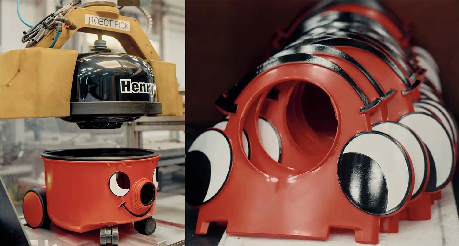
Unlike vacuum cleaners, consumers tend to notice meaningful improvements in the capabilities of smartphones every 3-5 years. Fairphone launched the Fairphone 1 in December 2013. They rightly deserve praise for a business built on lowering their environmental impact, from material sourcing and labour conditions to modularity and repairability. Despite these best intentions, Fairphone managed only 4 years of spare parts until the impact of managing a growing supply chain of obsolescence forced their hand.
Repair not replace is nothing new. We've been doing this for hundreds of years for economic, if not environmental, reasons. Yet problems arise when we depend on the manufacturer's own parts for repair. Right to repair is as much mindset shift as engineering challenge and retaining all of the power with manufacturers is little better than providing no repair option at all.
Brands and manufacturers must learn the benefits that arise when they relinquish control of the repair process to their customers. As designers, our brief is simple. We must design for repair, assuming we'll no longer be there to help.
And it all starts with taking things apart.

Design for re-assembly.
We've been designing for disassembly for a while now. Disassembly, not re-assembly.
Designing for disassembly grew from the need to separate parts into different recycling streams and support the recovery of high-value metals. Nobody does design for disassembly better than the Phillips Sonicare toothbrush, whose manual notes "this process is not reversible" before graphically wrapping the toothbrush in a cloth and smashing with a hammer to access the battery.
Designing fracture lines or breakaway regions into products certainly supports the recycling effort, but feels like an admission of failure that the product is destined for a short life. At worst, it will actively frustrate attempts to repair the device.

Design for disassembly is often destructive. Design for re-assembly never is.
Four years ago IKEA's Lisabo table introduced a new wedge dowel construction technique. Pitched as a tool-less assembly system, the instructional gif included conspicuous use of a tool to complete the installation of the legs.
Far more interesting was how the lack of glue and increased structural integrity meant it could easily be reassembled many times. "People move a lot more now," noted Jesper Brodin, IKEA's supply manager dryly. "There are more divorces. So if you get kicked out in the morning you can reassemble your table in the afternoon.". Building on this perceived shift from nest building towards transcience, IKEA launched a set of disassembly instructions for Billy, Pax and four other best-selling products. For a company once responsible for 1% of global wood consumption, every Billy taken apart is another Billy that doesn't need to be produced.
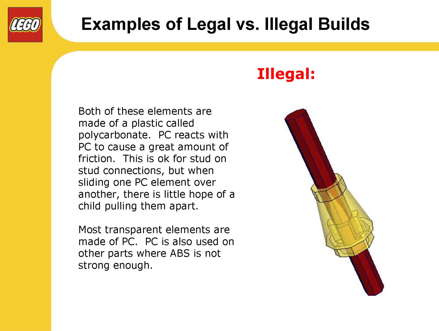
Even LEGO, the definition of reusable products, takes design for re-assembly seriously. LEGO Design Manager Jamie Berard's Stressing the Elements presentation contains 35 pages of illegal builds which stress, deform or otherwise risk permanently damaging the bricks. It also contains the memorable line: "Some LEGO projects require an engineer to determine whether an angle is legal."
So how can we design for re-assembly in consumer electronics?
The original Maker's Bill of Rights is a superb, succinct summary of the fundamentals. iFixit teardowns are a goldmine of cautionary tales on topics like stretch-release adhesive, access to the battery, awkward parts like copper tape or use of standard internal fixings.
For a more positive example, the 70 year old bakelite body of Austrian Post project Nr. 121 is an exemplar of design thinking.
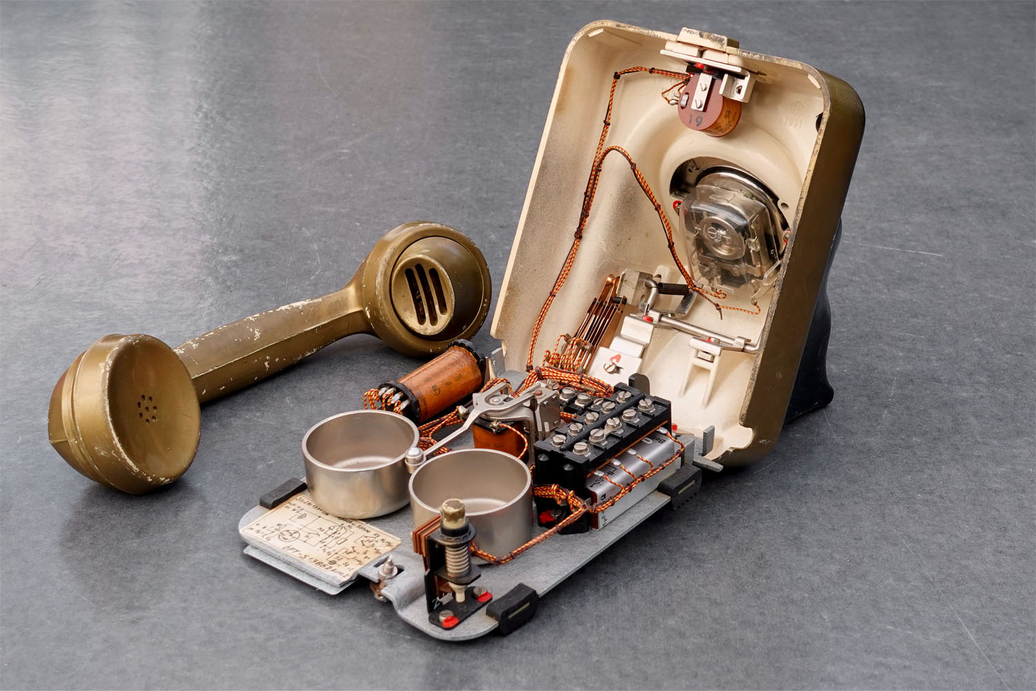
It opens with a single flat-head screw. The wide screw slot meaning any flat sided object can be used to open it - no need for a screwdriver let alone a bespoke tool. The use of a captive screw here is genius: a slight cost increase offset by never getting lost, with turned ends to aid alignment when re-closing.
Inside, every mounting point is fixed in a common plane with a common screw size. The telephone doesn’t even need to be re-orientated or inverted to open and inspect in the first place. Wiring looms glide through the air on elegant support trusses with no hidden return paths or buried cables. All that's missing is some colour coding to help identification at each end.
For all the beauty in KS1952's wiring design and component layout, there's one small detail that always catches the eye when you first open it up. It's the most unlikely resident inside. A delicate, hand-drawn, paper schematic.

Accessible documentation
Until recently, the biggest obstacle to sharing design documentation was often legal, not technical. It's less than 10 years since Toshiba used copyright law to force Tim Hicks to take down copies of their repair manuals. Five years ago Microsoft were still applying illegal "warranty void" stickers over casework screws, a practice that's been illegal in the US since 1975.
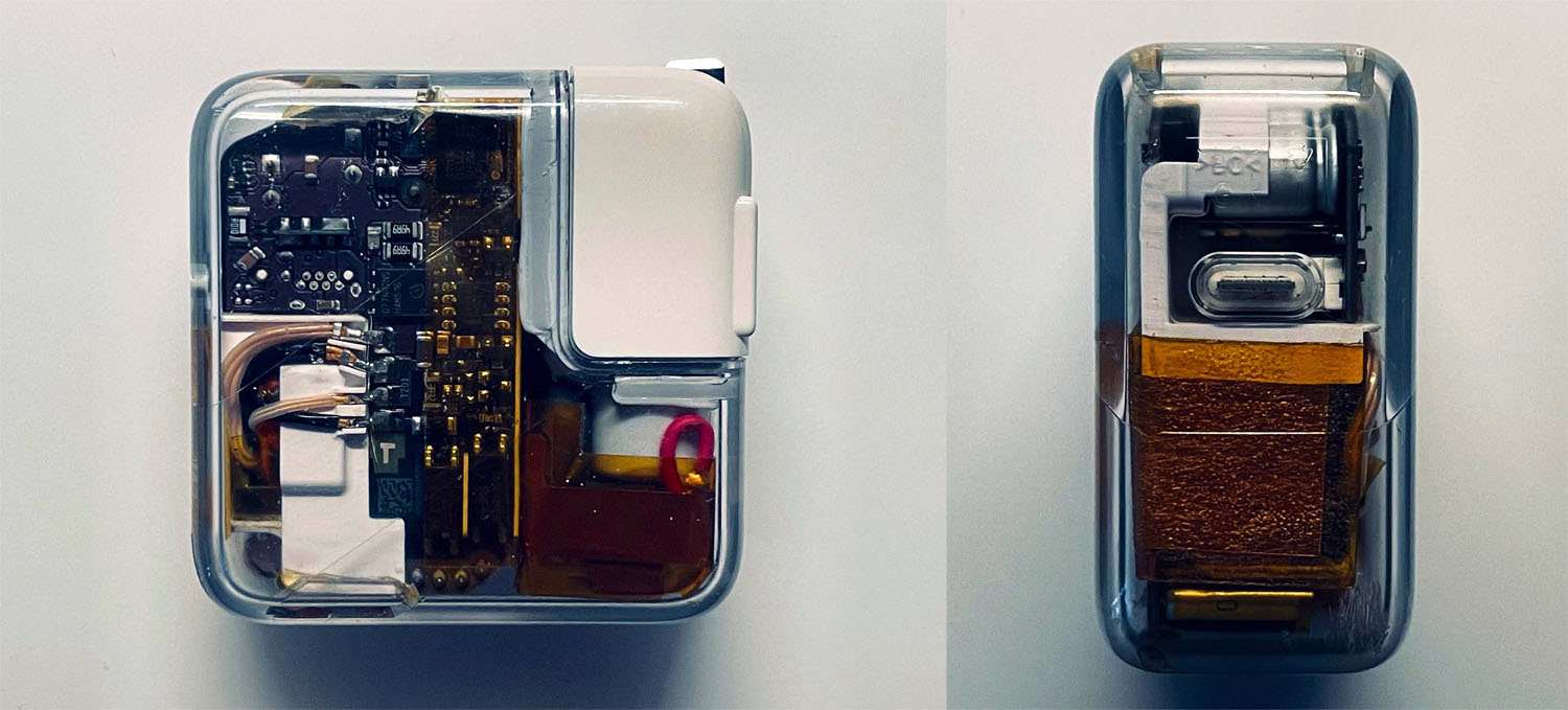
Times change. Savvy brands now realise that their product's commercial success depends more on the celebration than the secrecy of their underlying engineering. This summer, Nothing revived the 90s transparent casework to showcase the internal technology of their ear(1). And one brand's marketing certainly celebrates better than most, with their manufacturing videos, CAD drawings or even knolling art.
Sharing product documentation, especially where it brings added value, is a natural next step.
Sometimes documentation can be redundant. Strip down an Anker USB cable and you'll find four coloured-coded wires: red, black, green and white. Presumably this helps during the assembly process, but it also makes repair work a breeze. UK and EU mains wiring is similarly colour coded. Software developers will joke about self-documenting code that's so clear it doesn't even need comments. Maybe this is the hardware equivalent?
For anything more complex, the first question will be where do you put your documentation?
If you want it to last, anywhere but your own website would be a good start. AllDataSheet has over 50 million component datasheets, Octopart has millions more. Archive.org have stored almost 20,000 computer manuals. Some manufacturers collaborate directly with iFixit to create repair documentation, most notably Patagonia, Motorola and HTC.

There's another option of course, which is to directly embed the documentation into the product itself. Electronics engineers have done this for years for component identifiers, batch control information, production remarks or more. As Dave Smith's Prophet 12 synthesizer shows, if you're going to the effort of silkscreening on your own face, you might as well provide helpful "Do not unscrew" advice for future repairs.
UK replacement plugs ship with small cardboard wiring notes, and the Austrian telephone engineers showed that even printed documentation is remarkably durable inside a casework. My Dad's own clock radio from 1971 came with an entire circuit diagram inside the instruction booklet. Modern examples are harder to come by, but HP deserve particular credit here, not only for their excellent disassembly documentation, but also for including stickers inside their workstations that detail the component layout and link (via QR code) to further resources.
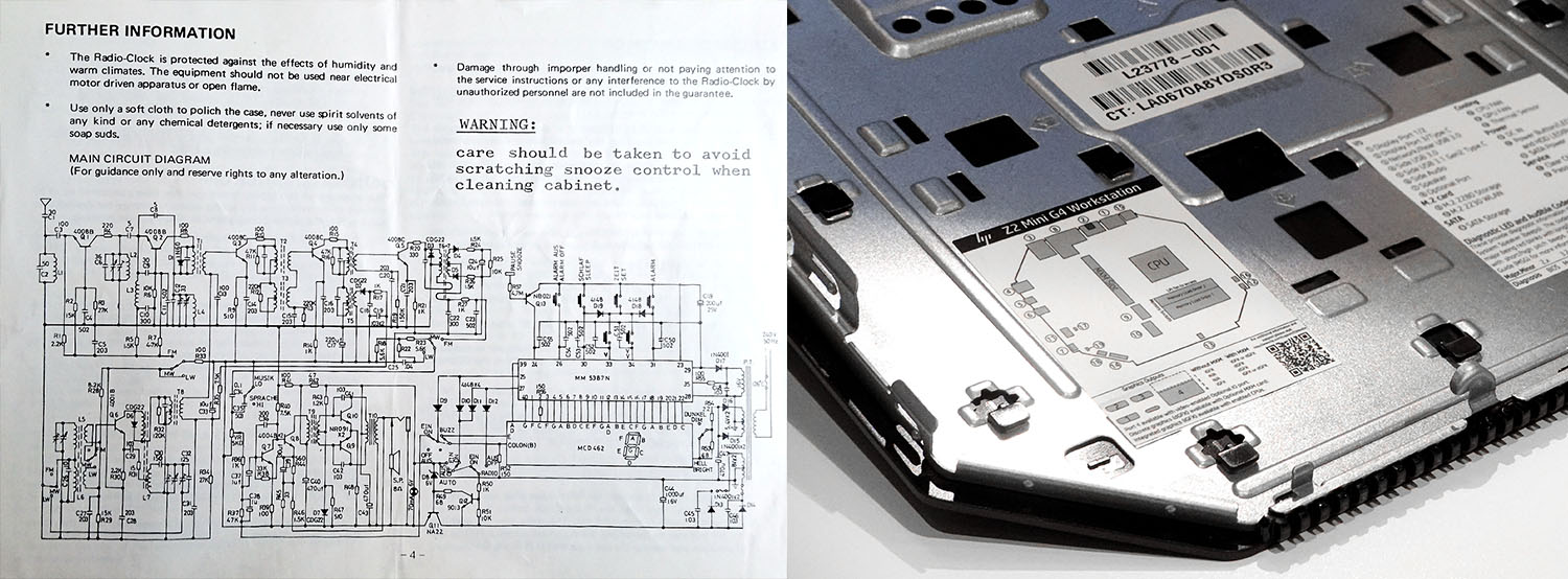
Like PCB silkscreen notes, in-mold details like text effectively come for free. Products from power supplies to plastic bottles routinely mold recycling icons, tooling cavity numbers or even product specifications into the casing.
Why not capture even more?
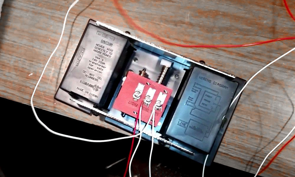
Open up a fuse box, hi-fi or doorbell and you'll likely find detailed notes or even wiring diagrams. Some car fuse boxes even contain a tool to help you do the repair yourself. The door chime below molds a complete assembly guide into the plastic housing for zero additional part cost.
A mindset shift from "hide the internals" to "someone is going to see this" is all you need to get started. Suddenly the whole product, inside and out, becomes a canvas for brand building, customer support and ultimately, design for repair.
How to proceed
Last month Jo Barnard updated Dieter Ram's famous ten principles for the modern era. 10 principles that could save the world is an excellent checklist of your responsibilities when starting out on a brand new project.
Principle 5 "Good design is designed for appropriate lifespan" is especially relevant here. Outside of consumer electronics there are alternative strategies besides ongoing product repair. Jo highlights Wild deoderant, with refills supplied in compostable packaging designed to degrade as quickly as the refill is consumed. Or you can always pass your product on, like say sending your memory sticks to Flash Drives for Freedom to be repurposed as an anti-propaganda courier in North Korea.
For everything else, in a world where we consume at nearly twice the speed the planet can regenerate, our imperative as designers is to push that end-of-life moment as far into the future as possible.
- Define and publish a replacement parts policy with any new product launch. Focus on high wear items like batteries, connectors and switches, and what will happen when supply chain obsolescence kicks in.
- Design for re-assembly, avoiding destructive steps, bespoke tools and delicate, internal procedures.
- Commit to publishing documentation to support ongoing repair: online, alongside or even within the product itself.
It's time to design the last product our customers will ever buy. You've got this.

