Octopus, solar & e-paper energy dashboards
May 2025
I live in a house with solar power, battery storage and an experimental energy tariff that adjusts with national demand. The hardware and data are awesome, but most smart meters and apps do a terrible job at explaining what’s actually happening behind the scenes.
So I built this.
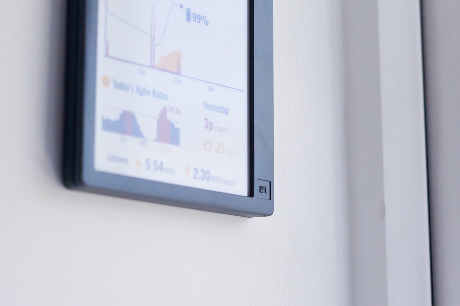
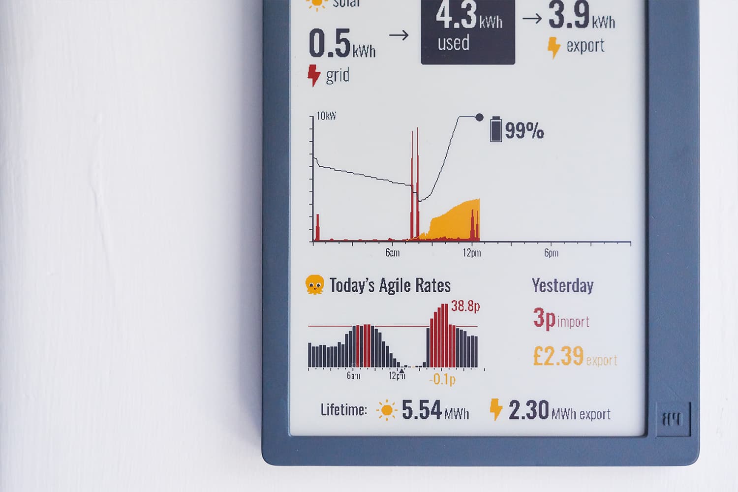
Every fifteen minutes, this e-paper dashboard updates with real time data from our household energy flow.
E-paper displays have a beautiful, non-intrusive aesthetic. I’ve spent a long time designing for low-res displays across products like bikes, thermal cameras and industrial robotics. Designing within a 2-bit colour palette, with no anti-aliasing and a one-minute refresh rate, is a welcome break from the monotony of modern UI .
This post is a deep dive into the data, hardware, API design, and pixel pushing that brought this dashboard to life.
Tariffs
Our UK energy provider is Octopus, once a young startup who’s CEO responded to customer complaints on Twitter and now the biggest provider in the country (the CEO still replies on Twitter). Octopus’ Agile tariff is pretty unique in that the unit price varies every 30 minutes, with prices fixed and advertised 24 hours in advance (although machine learning can predict further out). Pricing is set relative to the forecast balance of supply and demand, the principle being to incentivise people to shift their consumption away from peak times. The demand side is reasonably predictable (seasonal shifts, the 4-7pm peak etc), but with wind supplying 30% of the UK’s energy mix, the Agile tariff forecast often feels like a forecast of Scottish coastal wind speeds.
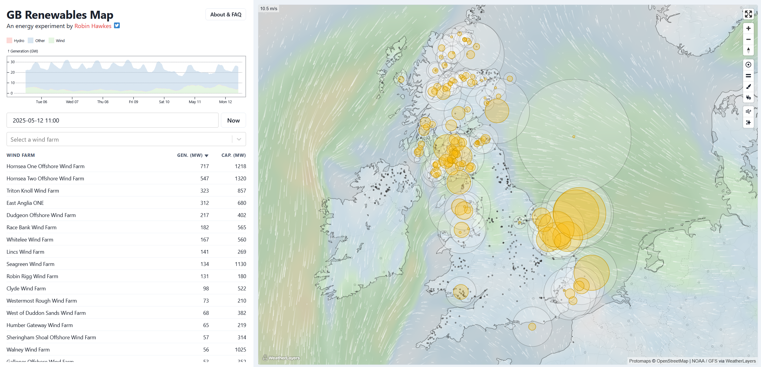
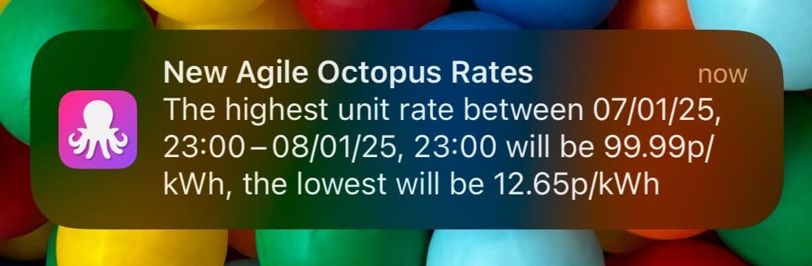
The maximum Agile unit price is capped at £1/kWh, around 4x greater than their current fixed rates. However it can also go negative, where I am literally paid for all the energy I can consume (turn on the oven! open the oven door!). This is not uncommon - UK renewables often generate more electricity than can be utilised. What exacerbates this effect is the problem of moving the electricity to where it’s needed.
Our electricity transmission network has a significant bottleneck between Scotland and England, and Scotland’s current generation capacity of 20GW is 5x the Scottish peak winter demand. When all that power can’t be shifted southwards, wind farms are curtailed (and paid to do so) and even worse, gas power plants in the south might be needed to fulfil the demand. Wasted wind can cost the UK millions of pounds per day. Octopus’ experiment is trying to incentivise customers to consume more, since paying them to do so is cheaper than paying the wind farms to turn off.
That’s the theory at least.
In practice, we have two young children who demand to be fed between 4-7pm. My lectures to them about national energy generation appear to have had no effect. With no change to our daily habits, we aren’t any worse off on Agile. But as you’ll see later, we aren’t really saving much either, and building this project has made me question if we should abandon it entirely in favour of a more conventional tariff.
Hardware design
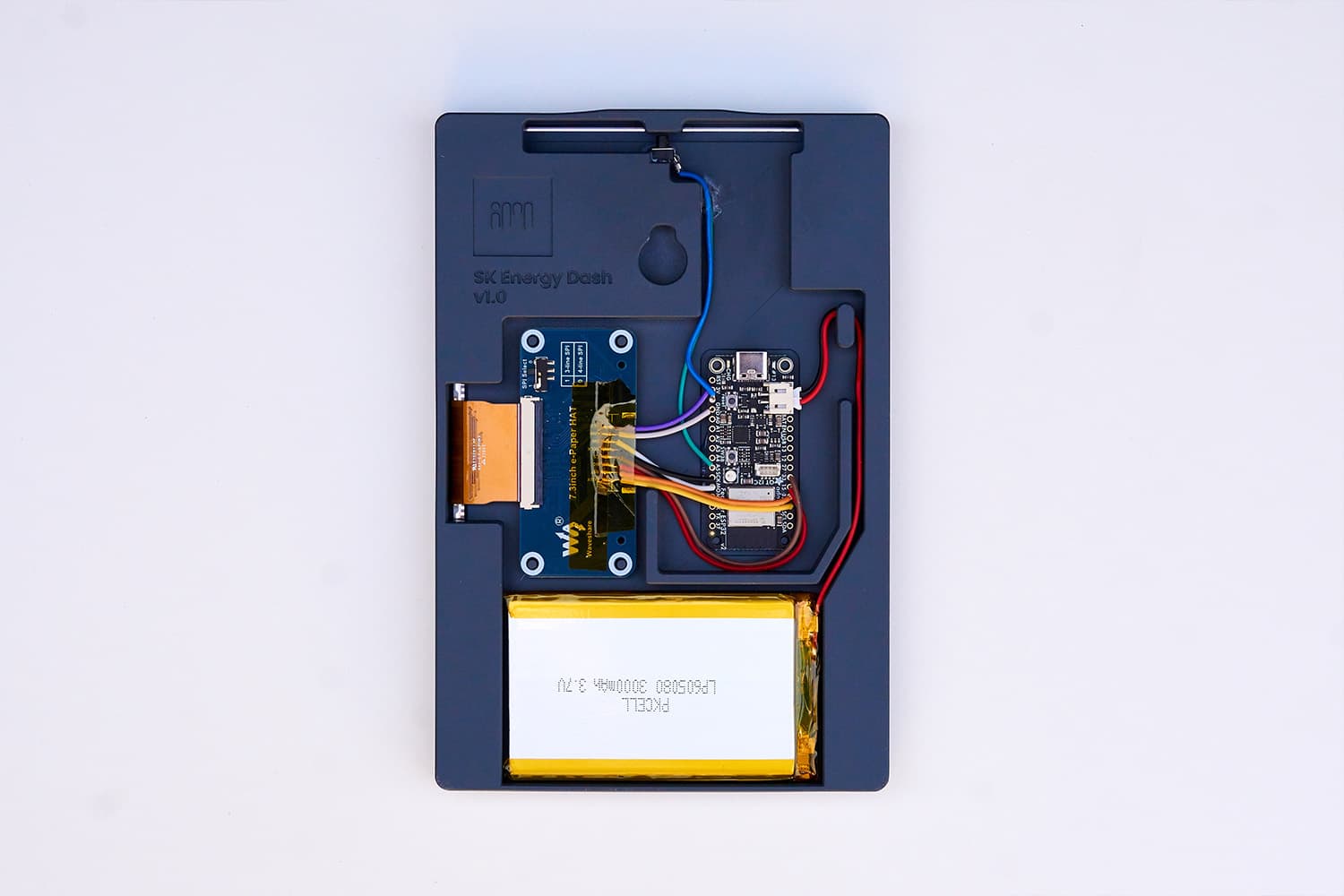
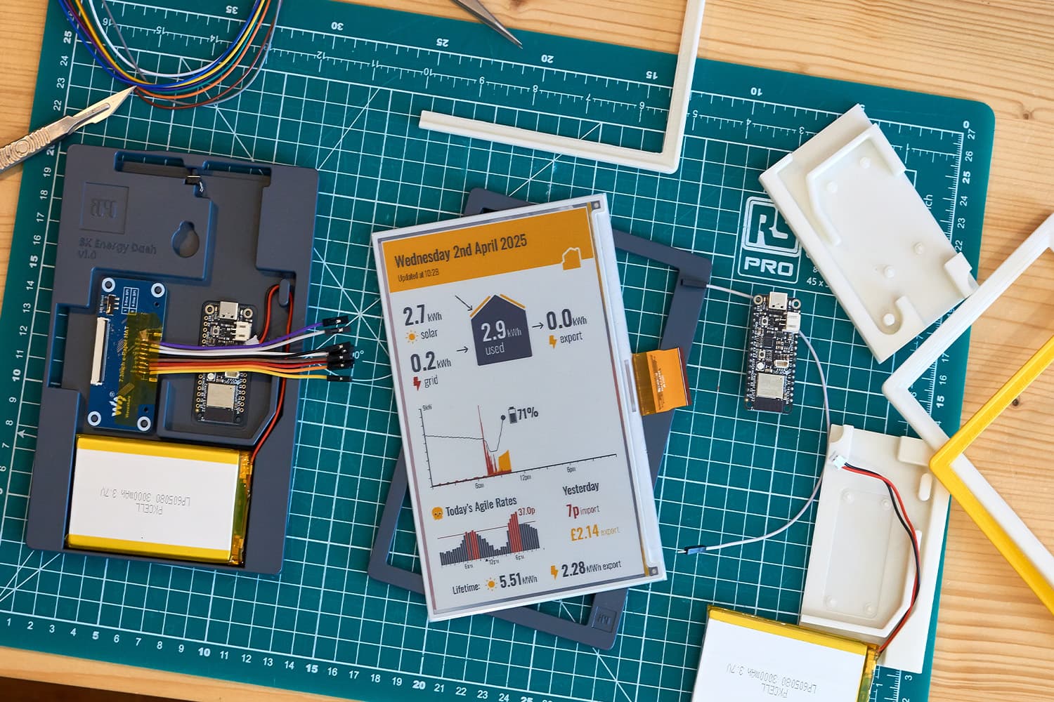
Waveshare make a brilliant 800x480 e-paper display. It has a vivid red/yellow/black/white colour scheme that’s perfect for rendering energy data. My dashboard is controlled by an Adafruit ESP32 Feather V2, connected via SPI to a Waveshare e-Paper HAT with the headers de-soldered to make it as slim as possible. There’s a battery, push button embedded in the flexible casing, and that’s it.
One of my prototyping principles is to keep the hardware stupid and the intelligence remote. Keeping all of the graph composition on the server makes future upgrades trivial and the embedded code simple. The ESP32 wakes every 15 minutes, fetches an image from the server, renders it to the display, and then goes to sleep, giving it a battery life measured in months. I change the colour of the onboard RGB LED (WS2812B / NeoPixel) to track status throughout this process.
The server generates images as bitmaps, leaving the ESP32 to do the conversion to 2-bit colour. This isn’t the most efficient approach (it takes about a minute to download and process the full image), and was initially prone to HTTP timeout errors and some interesting BMP parsing bugs. However the beauty is that the hardware is then standalone - I can point the ESP32 at www.server.com/test.bmp and it just knows how to display it.


The bmp → rybw conversion uses a simple colour quantisation. I use slightly offset colours to compose the images (#DA0000 and #FFC700), as pure red and yellow were too harsh to stare at whilst designing, and these RGB values were closer to the real life screen. I also replicated the quantisation on the server (hidden behind a ?2bit URL flag) to help me tune the thresholds, particularly for the anti-aliasing at the typography edges where rogue black pixels would appear.
uint8_t color;
if (r > 150 && g > 100 && b < 100) color = 0b10;       // Yellow
else if (r > 150 && g < 100 && b < 100) color = 0b11;  // Red
else if (r + g + b > 380) color = 0b01;                // White
else color = 0b00;                                     // Black
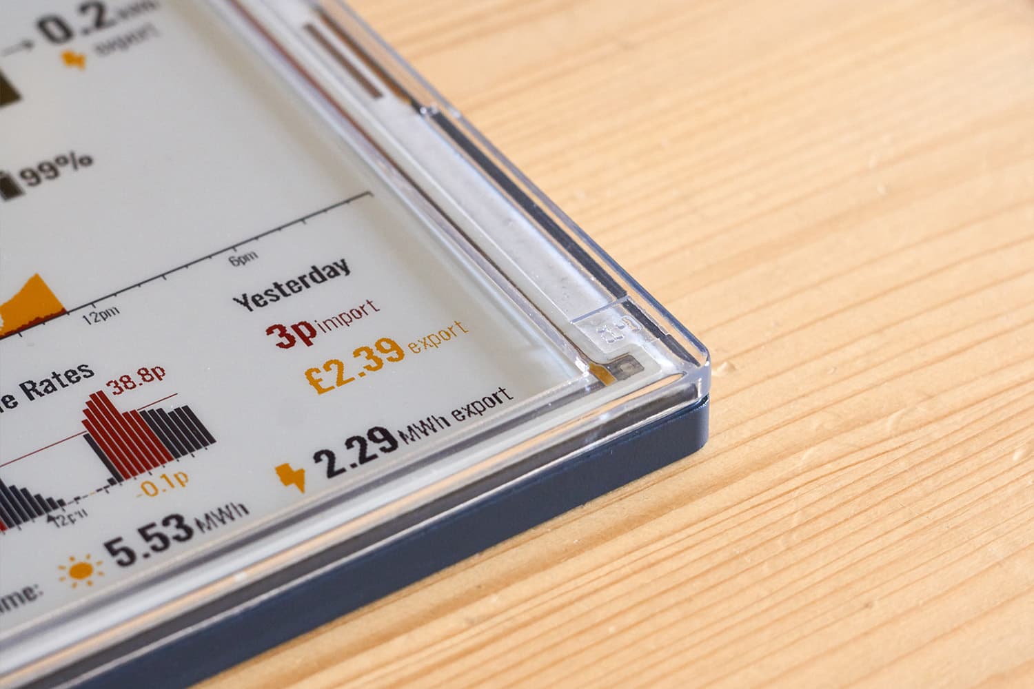
For the case itself, I experimented with a transparent casing in keeping with the consumer electronics trend popularised by by Nintendo and Apple and more recently revived by Nothing. Transparent SLA printing is cheap and extremely high quality, but I ultimately preferred the logo detailing on the opaque SLA design.

Backend design
The backend has two parts:
- A set of scripts, called at intervals to fetch data from Octopus and my inverter’s cloud service (Solax)
- An API for my house, with an endpoint to provide a rendered image for the dashboard
Of course, some might say why not use Home Assistant or ESPHome for all this, rather than build it all from scratch. To which I’d reply, where’s the fun in that?
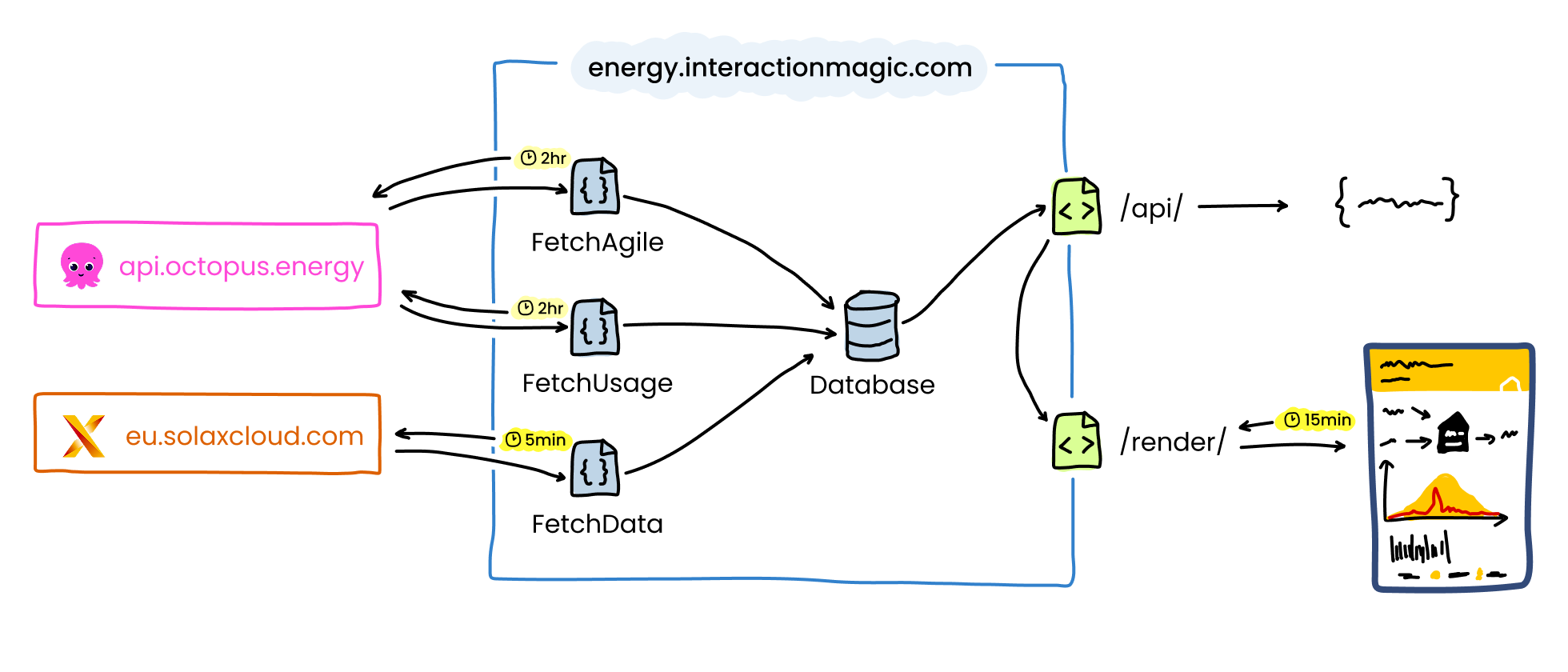
Octopus API
Octopus have a great set of APIs. I make use of two endpoints:
- Consumption data for past 24hrs:
https://api.octopus.energy/v1/electricity-meter-points/ - Agile rates for forthcoming 24hrs:
https://api.octopus.energy/v1/products/
These endpoints require your meter’s MPAN, serial number, and tariff/product codes, which require an API key from here. All but the product code can be found by calling https://api.octopus.energy/v1/accounts/<account-number>/, although the product code can be easily inferred by stripping the region-specific data from the tariff code, e.g:
$tariff_code = "E-1R-AGILE-24-10-01-G";
$product_code = "AGILE-24-10-01";
Agile tariffs vary based on region (specifically by varying the distribution costs coefficient and peak-time premium value), so it’s important to get the product and tariff codes correct.
The biggest challenge I had was formatting the date ranges correctly for the API. Debugging was made hard as there is a significant lag before the consumption data becomes available, and sometimes a partial day is uploaded first. Gas data lags electricity data, and Agile tariffs are only initially supplied up to 11pm the next night. I have an Octopus Home Mini so I can see real time consumption in the app, but it doesn’t seem to make any difference to how slow the API is.
Octopus require ISO8601 dates in UTC (using Z suffix), so here’s how I pull what I need:
function get_consumption_for($when){
	$date_start = gmdate('Y-m-d\TH:i:s\Z', strtotime($when));
	$date_end = gmdate('Y-m-d\TH:i:s\Z', strtotime("$when + 1day"));

	$api_url= "https://api.octopus.energy/v1/electricity-meter-points/$meter_mpan/meters/$meter_serial/consumption/?order_by=period&period_from=$date_start&period_to=$date_end";

	$context = stream_context_create([
		 "http" => [
			  "header" => "Authorization: Basic ".base64_encode($octopus_api_key.":")
		 ]
	]);
	$json_data = file_get_contents($api_url, false, $context);
  return json_decode($json_data, true);
}

// Called like this, with human readable date ranges
get_consumption_for("yesterday - 1 day");
get_consumption_for("yesterday");
Every two hours I fetch my consumption data and compare what’s returned to see if there’s anything new. Agile rates becomes available around 4pm, so I pick these up at the same time once they're published.
If you want to get started playing with the Octopus API, then Guy Lipman’s guide is a good place to start.
Solax API
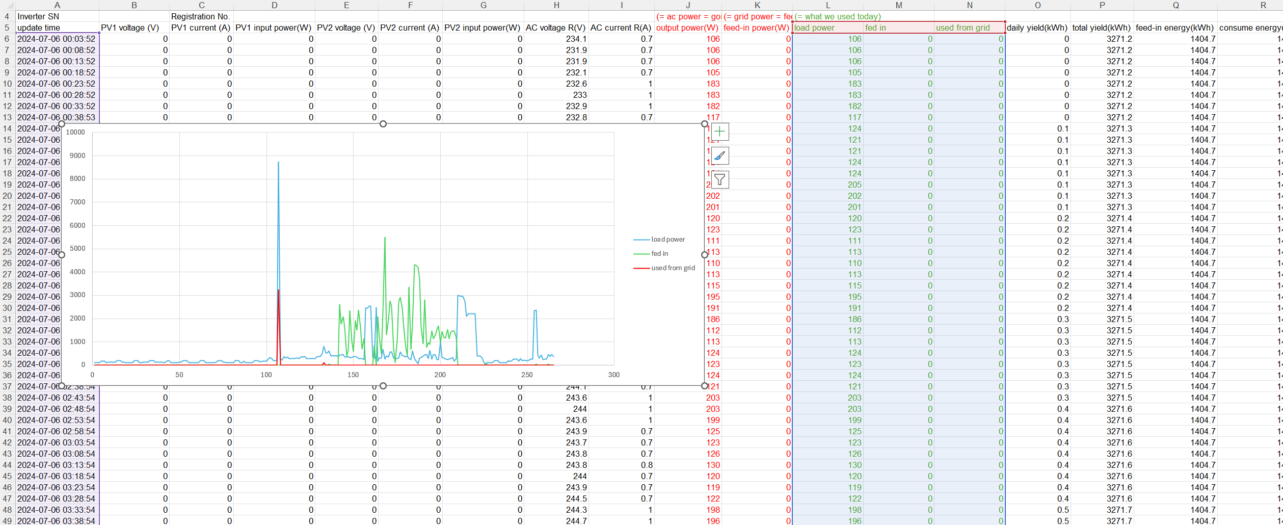
I have a Solax X1-HYBRID G4 inverter, which comes with a confusing app and single API endpoint. In theory, data is uploaded to their cloud service every 5 minutes, and the 19 parameters this endpoint provides should be all I need.
The API appeared to be accessible at https://solaxcloud.com, but in the UK I needed to explicitly use https://eu.solaxcloud.com/ since Solax use a global load balancer that resolves the DNS differently depending on where you’re based - a nightmare to debug when I moved from testing locally in UK to my servers in the US (shoutout to Michael Maclean for his help fixing this).
Here’s an example Solax API response:
{
  "success": 1,
  "exception": "Query success!",
  "result": {
    "inverterSN": "**********",
    "sn": "*********",
    "acpower": 3747,
    "yieldtoday": 10.7,
    "yieldtotal": 6361.7,
    "feedinpower": 3359,
    "feedinenergy": 2777.8,
    "consumeenergy": 3349.99,
    "feedinpowerM2": 0,
    "soc": 99,
    "peps1": 0,
    "peps2": null,
    "peps3": null,
    "inverterType": 15,
    "inverterStatus": 102,
    "uploadTime": "2025-05-12 11:47:25",
    "batPower": 0,
    "powerdc1": 1762,
    "powerdc2": 2160,
    "powerdc3": null,
    "powerdc4": null,
    "batStatus": 0,
    "utcDateTime": "2025-05-12T03:47:25.447Z"
  },
  "code": 0
}
Untangling this into a meaningful set of data was particularly painful due to the confusing nomenclature and non-existent documentation.
Daily energy totals are provided by the yieldtotal (what we generated from solar), feedinenergy (what we sent to the grid) and consumeenergy (how much we pulled from the grid). The energy our house used is thus yieldtotal - feedinenergy + consumeenergy. For the real time power data, (acpower - feedinpower) is what our house is currently using, and the sum of (powerdc1 + powerdc2) provides the solar generation.
However whilst the instantaneous rates in watts are real time figures, all of the kWh energy values are lifetime values since the inverter was first installed(!). On their own these are pretty meaningless, therefore I call this endpoint every 5 minutes, and subtract the first provided response of the day from all subsequent readings. If I miss the first value due to a server issue, the entire day’s calculations might be incorrect and my API will warn as much:
"solax_data_points": {
	"total": 212,
	"earliest": "2025/05/06 03:09:52",
	"latest": "2025/05/06 22:41:05",
	"message": "Data did not start at beginning of day. Daily totals may not be correct."
}
Building an API for my house
Having got all the above APIs working, I never wanted to think about them again.
My house now has its own energy API located at https://energy.interactionmagic.com/api/, serving a clean, structured set of energy data for this (and future) projects.
I’ve long been jealous of Terence Eden openly sharing his solar generation data and having it cited in academic research. However providing an open real time feed, even if read only, seems a bit risky (you’ll know when I’m home, or not), so I’ve added some basic auth on there for now.
Here’s an example of the API response, truncated for brevity:
Expand API example
{
	"success": 1,
	"time": "2025/05/06 22:45:57",
	"debug": {
		"solax_data_points": {
			"total": 272,
			"earliest": "2025/05/06 00:00:52",
			"latest": "2025/05/06 22:41:05",
			"message": ""
		}
	},
	"solax": {
		"last_update": "2025/05/06 22:41:05",
		"daily_total": {
			"from_solar": 29.9,
			"from_grid": 16.2,
			"used_house": 27,
			"to_grid": 19.1
		},
		"lifetime_total": {
			"from_solar": 6234.1,
			"from_grid": 3286,
			"used_house": 6834.9,
			"to_grid": 2685.2
		},
		"battery": {
			"soc": 10
		},
		"daily_history": {
			"used_house": [
				{
					"time": "2025/05/06 00:00:52",
					"power": 94
				},
				{
					"time": "2025/05/06 00:05:52",
					"power": 86
				},
				...
			],
			"to_grid": [
				{
					"time": "2025/05/06 00:00:52",
					"power": 0
				},
				{
					"time": "2025/05/06 00:05:52",
					"power": 0
				},
				...
			],
			"from_grid": [
				{
					"time": "2025/05/06 00:00:52",
					"power": 0
				},
				{
					"time": "2025/05/06 00:05:52",
					"power": 0
				},
				...
			],
			"battery_soc": [
				{
					"time": "2025-05-06 00:00:52",
					"charge": 42
				},
				{
					"time": "2025-05-06 00:05:52",
					"charge": 42
				},
				...
			],
			"panel_power": {
				"east": [
					{
						"time": "2025-05-06 00:00:52",
						"power": 0
					},
					{
						"time": "2025-05-06 00:05:52",
						"power": 0
					},
					...
				],
				"west": [
					{
						"time": "2025-05-06 00:00:52",
						"power": 0
					},
					{
						"time": "2025-05-06 00:05:52",
						"power": 0
					},
					...
				]
			}
		}
	},
	"octopus": {
		"today": {
			"agile_rates": [
				{
					"from": "2025/05/06, 00:00:00",
					"to": "2025/05/06, 00:30:00",
					"rate": 14.889
				},
				{
					"from": "2025/05/06, 00:30:00",
					"to": "2025/05/06, 01:00:00",
					"rate": 15.6555
				},
				...
			]
		},
		"yesterday": {
			"to_grid": 0.37,
			"from_grid": 0.07,
			"from_grid_gas": null
		},
		"yesterday_minus_1": {
			"to_grid": 1.29,
			"from_grid": 0.03,
			"from_grid_gas": null
		}
	}
}
UI design
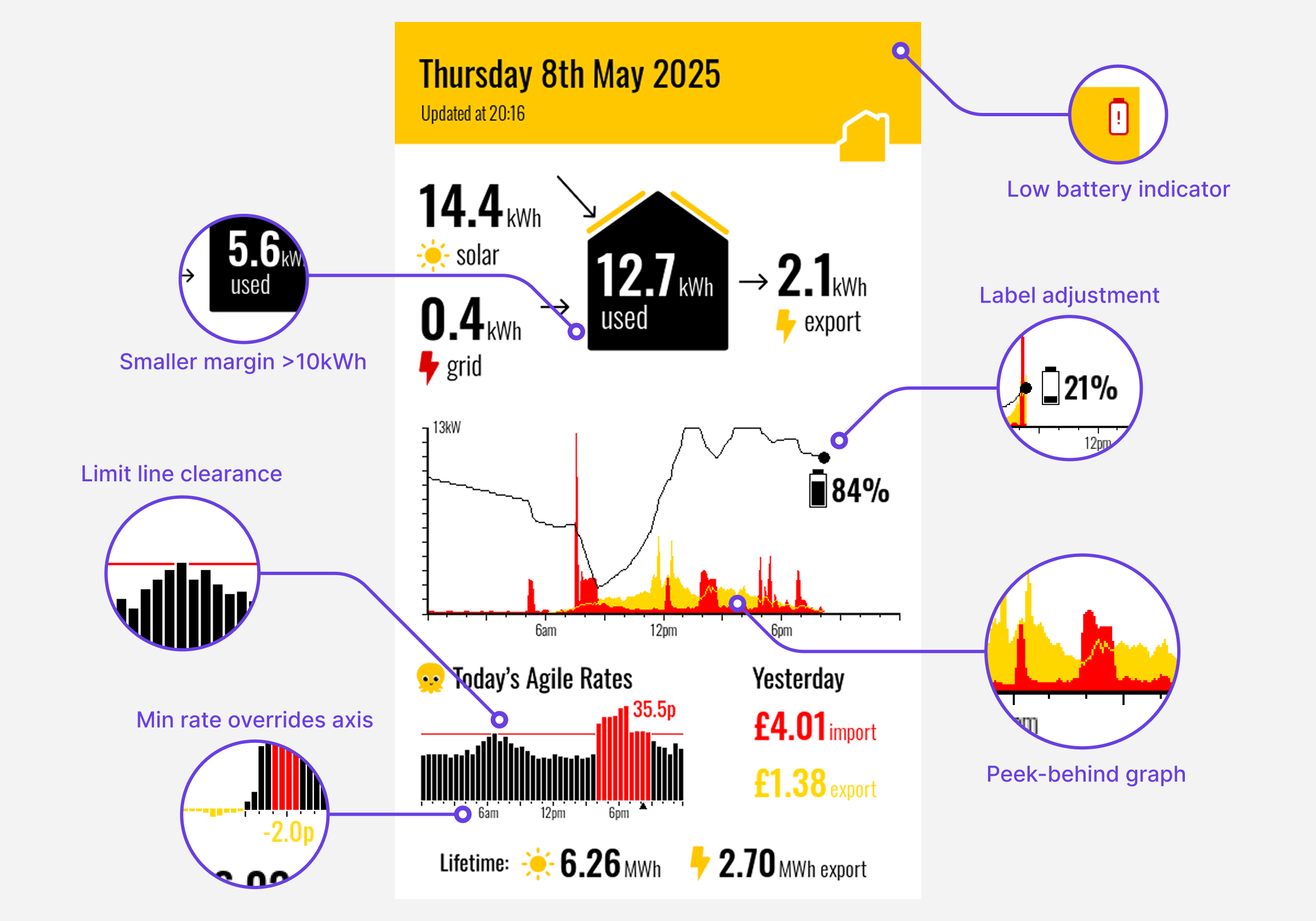
Low res, low-colour depth displays are awesome - the fewer pixels the better! With only 4 colours, no anti-aliasing and no animation, this is the sort of UI bitmap work that Macromedia Fireworks (RIP) would have excelled at.
I wanted to put the most relevant information front and centre in our house. Here are three principles I applied to the design:
-
Don’t make people do maths
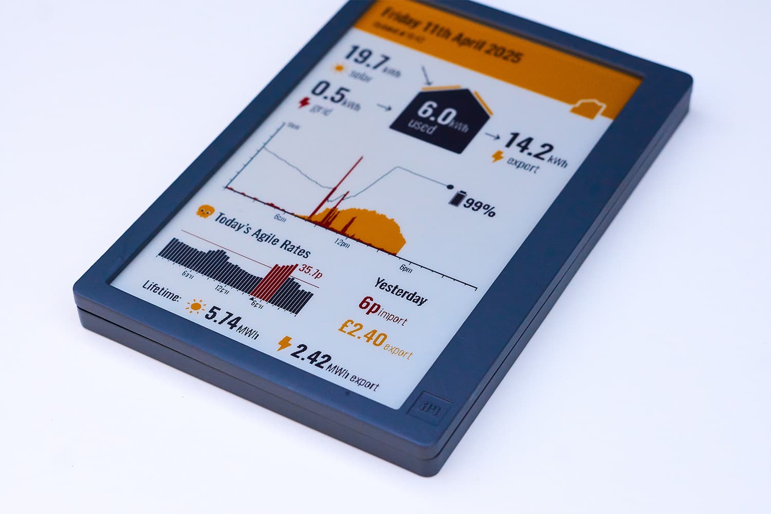
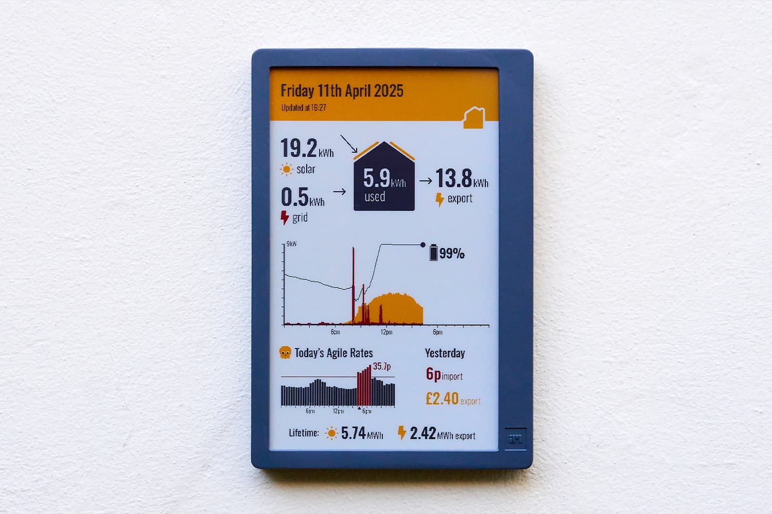
Most smart meters show costs inclusive of the standing charge. This obfuscates how much electricity you actually consumed, and makes comparing imported vs. exported costs awkward. The standing charge is really just an annual infrastructure tax, so I ignore it entirely and display two comparable figures side by side. If only I could get paid a standing charge for my export meter too!
The same logic applies to the flowchart. The number in the middle box (the house) can be calculated by subtracting the exported kWh on the right from the imported kWh on the left. But it’s important to still show all the numbers, because they all answer questions that I have when looking at the display. Normalisation is for databases, not dashboards.
-
Flowcharts flow left to right
Every solar app has some variant of the “what flows where” diagram, and rarely are they intuitive. To fix this I re-framed the energy flow in terms of my house, not the inverter or grid. Power from the solar and grid flows in, we use some, and some flows out. This avoided the typical flowchart confusion where exporting means energy flows backwards across the screen.
-
Design with real data
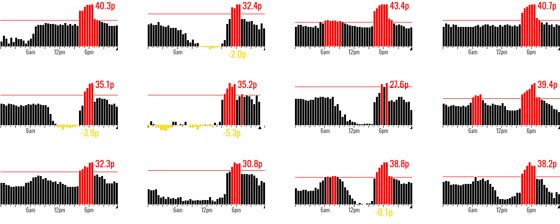
The daily Agile forecast has only 240 x 135px to communicate 48 half hourly tariffs, highlight the max rate, current rate, negative rates and which rates were greater than a typical flexible tariff. Creating a design layout to cover every permutation quickly got painful in Figma, so I shifted early to code, using real data pulled from the API and the ?2bit flag to prototype as close to the final hardware as I could.
I built the backend several months before I worked on the final UI, which meant I had a large pool of real data stored to easily re-render dozens of samples days whenever I tweaked the layout.


Since the entire dashboard was assembled in PHP, every text and graphical element is manually placed onto the canvas, there’s no layout framework or grid-template-columns: repeat(3, 20px); here. I’m particularly proud of the peek-behind solar graph, which renders the hidden outline of the solar in yellow on top of the daily load in red, to maximise the information density in only two bit colour. I also used Claude extensively on this project for the boring boilerplate logic, such as ensuring the peak agile rate was kept clear on any overlap on subsequent bars, or shuffling the battery SoC to keep it in view.
Where next?
Shortly after completing this project, we bought an electric car. So now I get graphs like this:
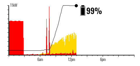
Neither our Hypervolt charger or EV have officially supported APIs, and I’ve already locked myself out of the official app trying to hack with this third-party tool. However it should be easy to identify and segment out, given it pulls a steady 7kW for a defined block of time.
The bigger question is whether it’s worth staying on Agile at all when we now have an EV? Over the twelve pre-EV months we spent £563 on electricity. This is a 4% (£22) saving compared to having been on a standard variable tariff, which doesn’t really seem worth the daily pricing volatility!
Most Agile aficionados see much more dramatic savings. I suspect our savings are limited because we cannot shift our 4-7pm mealtimes with small kids, and we run almost entirely on solar during the summer. Last summer we spent only £22.87 importing electricity (excluding standing charge) between May and August.
Right now, you should never charge your car from excess solar, since Octopus will pay for exported energy twice what they bill you for overnight car charging (15p vs 7p/kWh). As EV adoption grows this is likely to evolve, based on current tariffs the new daily demand peak would be in the middle of the night, twice as large as the evening peak.
Of course, switching away from Agile will also render my hours of design work on the graph redundant, which might be the biggest incentive of all to remain. All I know for sure is that I’m now a fully enrolled member of the home energy monitoring nerds club.